Visualize Cross-Locus Peptide Binding Results
Source:R/calculatePeptideBindingLoad.R
visualizePeptideBinding.RdCreates visualizations of peptide binding predictions across all loci. This function is designed for advanced cross-locus analysis where peptides from multiple donor alleles are tested against multiple recipient alleles.
Usage
visualizePeptideBinding(
  binding_results,
  plot_type = c("heatmap", "bar_by_recipient", "bar_by_donor", "scatter"),
  palette = "spectral",
  ...
)
Arguments
- binding_results
A list containing an `all_predictions` data.frame with columns: `donor_allele`, `recipient_allele`, `binding` (logical), `recipient_locus`, `mhc_class`, `donor_locus`, and optionally `ic50`.
- plot_type
Type of plot: "heatmap", "bar_by_recipient", "bar_by_donor", or "scatter"
- palette
Character. A color palette name. Defaults to "spectral".
- ...
Additional arguments passed to the ggplot theme.
Examples
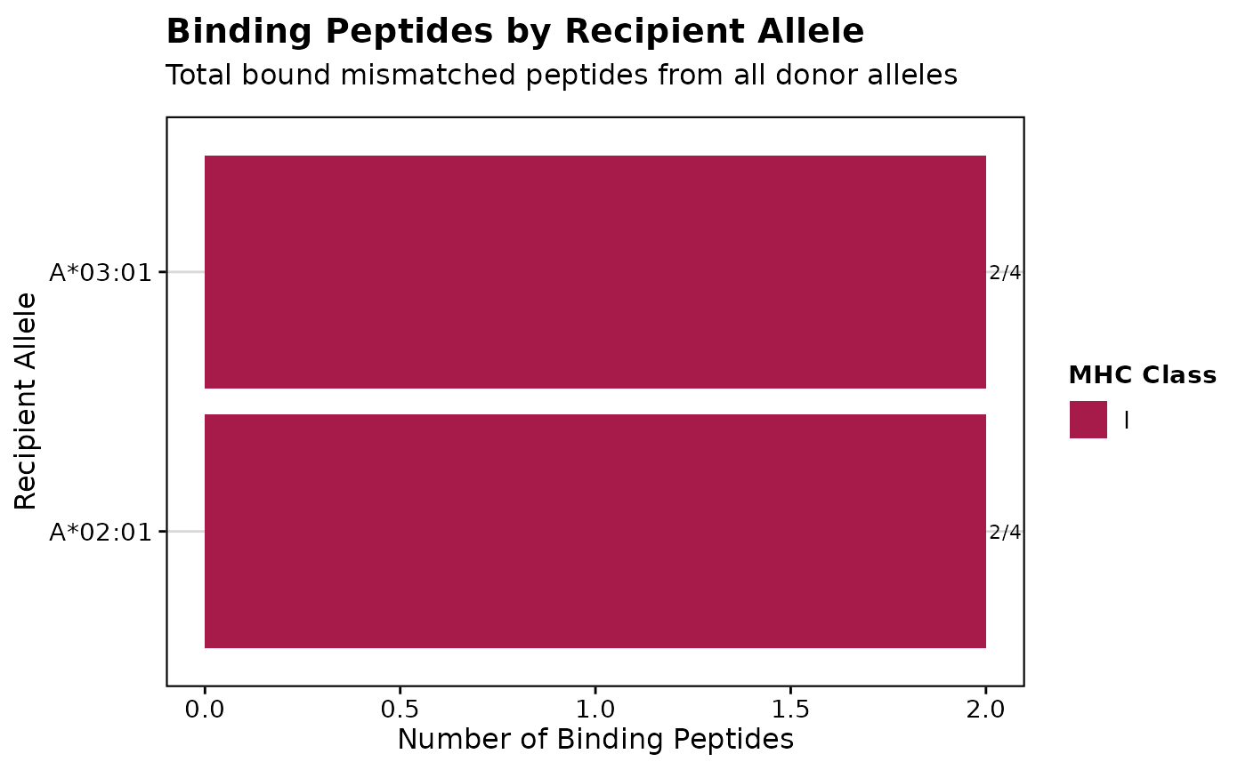
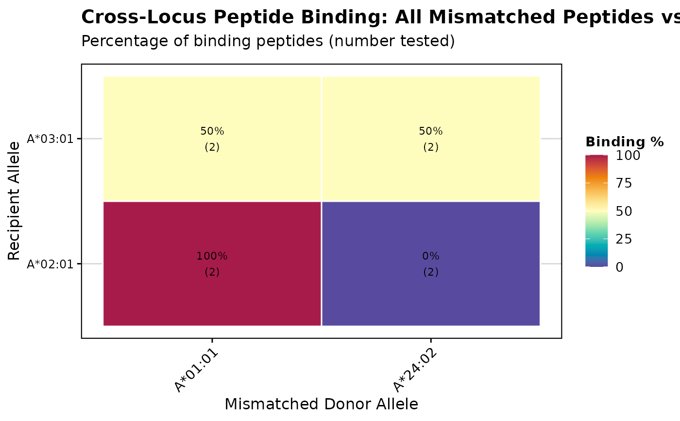
# Create example binding results data structure
binding_results <- list(
  all_predictions = data.frame(
    donor_allele = rep(c("A*01:01", "A*24:02"), each = 4),
    recipient_allele = rep(c("A*02:01", "A*03:01"), 4),
    recipient_locus = "A",
    donor_locus = "A",
    mhc_class = "I",
    binding = c(TRUE, FALSE, TRUE, TRUE, FALSE, TRUE, FALSE, FALSE),
    ic50 = c(100, 6000, 250, 150, 8000, 300, 7500, 9000)
  )
)

# Create heatmap visualization
p <- visualizePeptideBinding(binding_results, plot_type = "heatmap")
print(p)


# Create bar plot by recipient
p2 <- visualizePeptideBinding(binding_results, plot_type = "bar_by_recipient")
print(p2)
# Create bar plot by recipient
p2 <- visualizePeptideBinding(binding_results, plot_type = "bar_by_recipient")
print(p2)